
Cineteca Website Redesign
Scope
UX Research & UI Design
Brand
Cineteca Nacional (Case Study)
year
2025
Introduction
The Cineteca Nacional is one of Mexico’s most important cultural institutions, dedicated to preserving, promoting, and showcasing national and international cinema. It is a key destination for film lovers, offering a carefully curated selection of films, retrospectives, and special screenings.
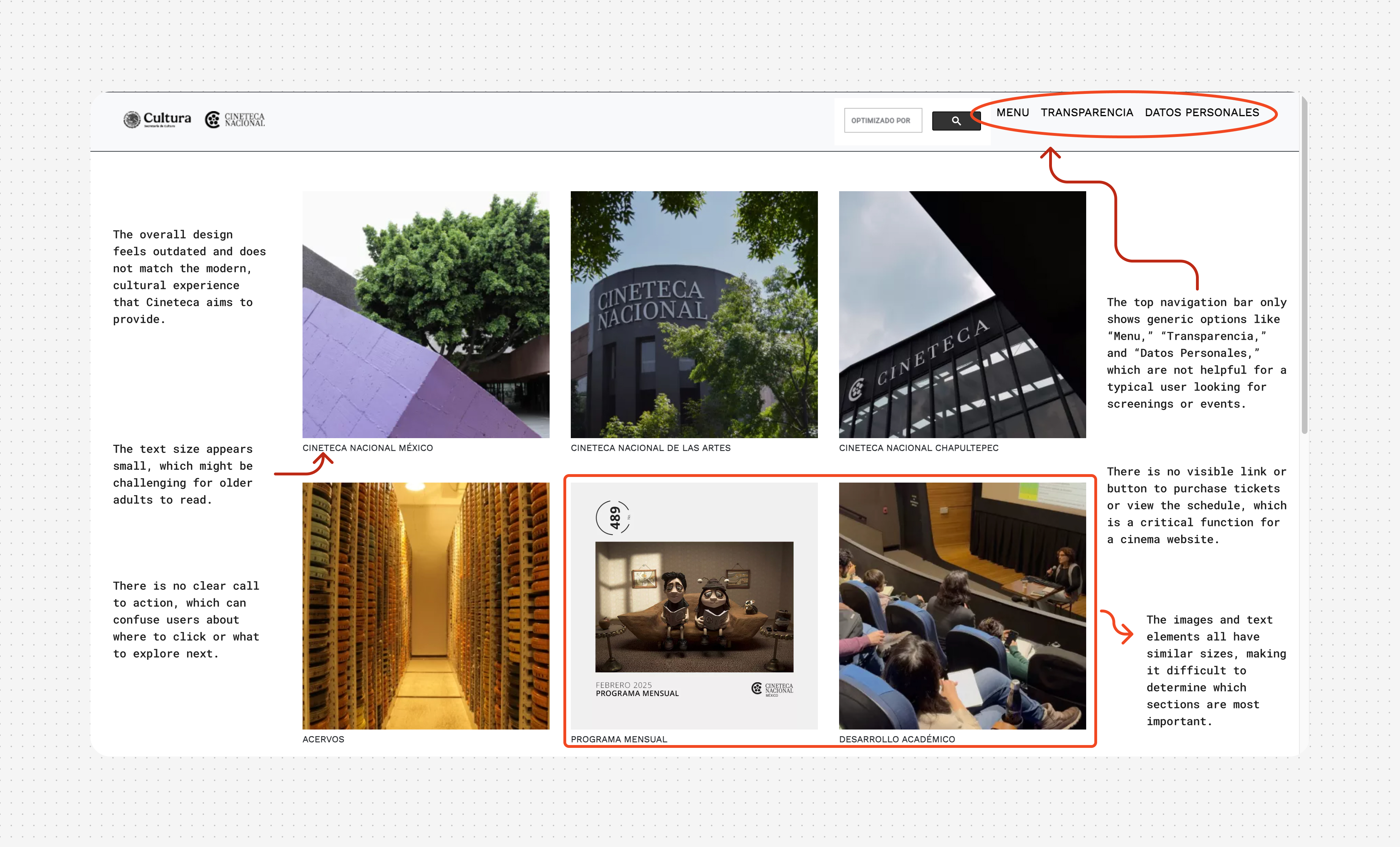
However, its website makes simple tasks unnecessarily difficult, such as checking the movie screenings or buying tickets. Navigation issues, accessibility problems, and an inefficient purchase flow have led many users to seek alternatives on social media or buy tickets directly at the box office.
This case study presents a conceptual redesign based on research, usability testing, and iterative design to enhance navigation, optimize ticket purchasing, and better integrate events and discounts.

1. The Problem
User research revealed recurring patterns that highlight the main flaws of the Cineteca Nacional’s website. Difficulties in finding key information, navigating between features, and making online purchases negatively impact the user experience, leading visitors to seek alternatives outside the website.
Key issues identified:
• Confusing navigation: Finding showtimes or event details takes longer than expected, and the separation between venues is unclear.
• Inefficient purchase process: The checkout flow includes unnecessary steps and displays sold-out tickets even when they are still available at the box office.
• Limited accessibility: The site does not allow users to apply INAPAM discounts online, forcing elderly visitors to buy tickets in person.
• Low event visibility: Users rely on social media to learn about film cycles and special screenings.
• Outdated design: Poor information hierarchy and small font sizes make reading difficult.
Redesign Objective:
Create a more intuitive and accessible digital experience that enhances navigation, streamlines ticket purchases, and improves access to events and discounts, aligning with user expectations.
2. Research and Key Findings
Empathy Map
To better understand user needs and frustrations, I conducted interviews with visitors of the Cineteca Nacional. Based on their responses, I created an Empathy Map, identifying behavioral patterns and recurring issues in their experience with the website.
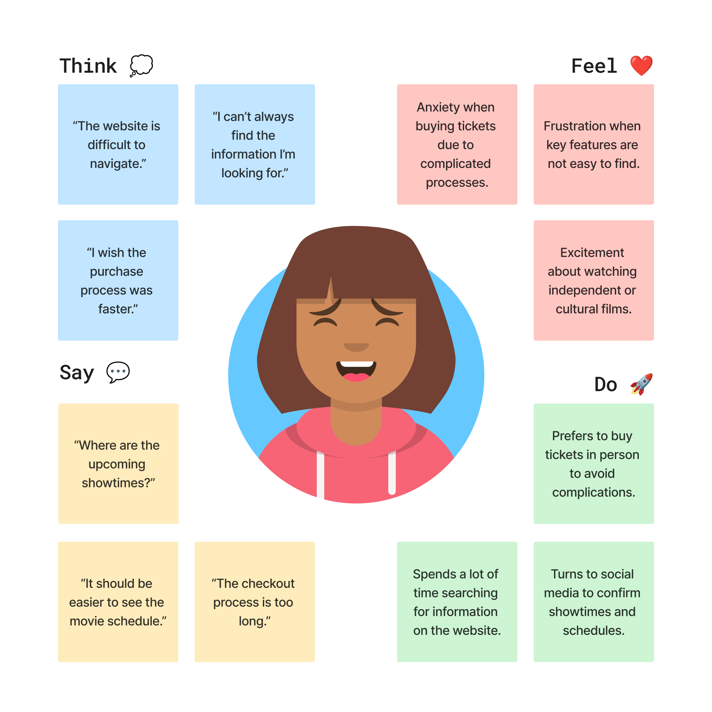
Using this information, I grouped users into user groups with shared goals and needs, which allowed me to develop user personas. These representations synthesize their motivations, frustrations, and expectations, providing a clear foundation to guide the redesign.
Personas, User Needs, Problem Statements, Hypotheses, and Goals

3. Competitive Audit and Opportunities
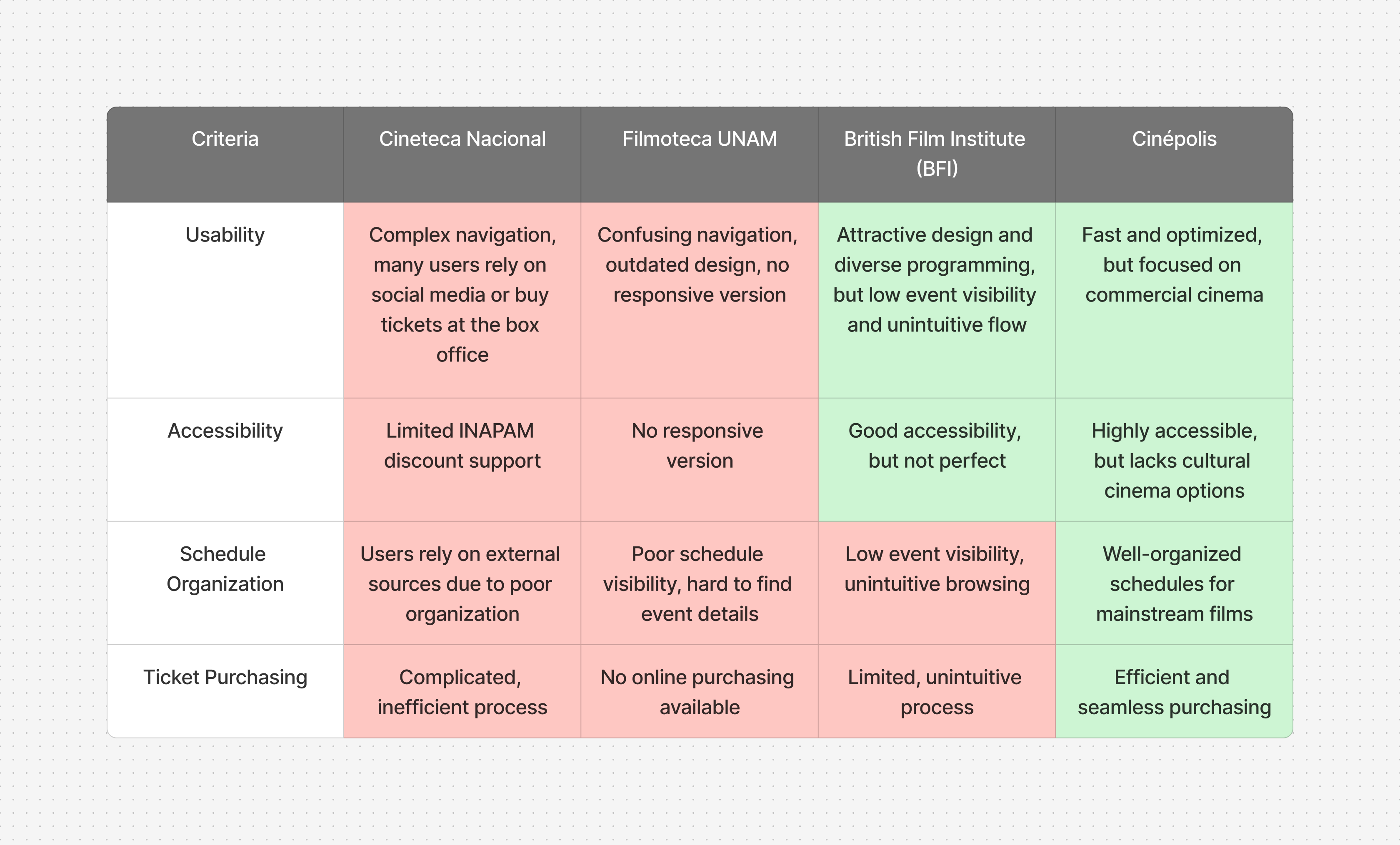
To assess the digital positioning of Cineteca Nacional, I analyzed three key references: Filmoteca UNAM, British Film Institute (BFI), and Cinépolis.
Analysis Approach
The audit compared usability, accessibility, schedule organization, and ticket purchasing, identifying opportunities to enhance Cineteca’s digital experience.
Currently, many users get lost navigating the website, end up relying on social media, or prefer buying tickets at the box office. This frustration is what I aimed to resolve.
Key Findings
• Filmoteca UNAM: Valuable content, but confusing navigation, outdated design, and no responsive version.
• British Film Institute (BFI): Attractive design and diverse programming, but low event visibility and an unintuitive exploration flow.
• Cinépolis: Fast and optimized ticket purchasing, but focused on commercial cinema with no options for art-house audiences.
Audit Takeaways
• The ticket-buying process should be as efficient as Cinépolis, without losing Cineteca’s cultural essence.
• Showtimes and events should be better organized to avoid the visibility issues found in the BFI
• The website needs modernization and improved navigation, addressing Filmoteca UNAM’s shortcomings.
Market Gaps
• A solid personalized recommendation system is missing from cultural cinema platforms.
• Navigation on these sites is often confusing, discouraging new users.
Key Opportunity
Commercial cinemas have perfected online ticket purchasing, while cultural cinema spaces present usability barriers.
This redesign seeks to merge the best of both worlds:
• The curatorial depth of Cineteca.
• A ticket purchasing and browsing experience as intuitive as commercial cinemas.
4. Ideation and Solution Exploration
After identifying the main issues with Cineteca Nacional’s website, I used the How Might We? (HMW) method to reframe them into questions that encourage innovative solutions. Then, through Rapid Sketching, I explored visual and structural improvements.
Reframing Challenges with HMW
Each user had specific needs, and the HMW exercise helped turn them into opportunities for improvement:
María, the Cultural Explorer (68 years old, retired)
• How might we make it easier for her to quickly access screenings and events of interest?
• How might we allow her to apply her INAPAM discount online without visiting the box office?
Luis, the Modern Cinephile (32 years old, designer)
• How might we make ticket purchasing fast and frictionless?
• How might we improve the mobile experience so he can easily buy tickets from any device?
Emma, the Tourist (36 years old, foreign visitor)
• How might we make the showtimes clear and easy to browse?*
• How might we improve the visibility of special events so she doesn’t miss relevant screenings?
Adrián, the Spontaneous Visitor (27 years old, advertiser)
• How might we quickly show him today’s available screenings so he can decide without hassle?
• How might we make the ticket purchase process as direct and efficient as possible?
This approach transformed insights into concrete ideas for improving Cineteca’s digital experience.
From HMW Questions to Sketching Solutions
Using the HMW questions as a foundation, I conducted a Rapid Sketching exercise to visualize key ideas and structure improvements in navigation, ticket purchasing, and accessibility.
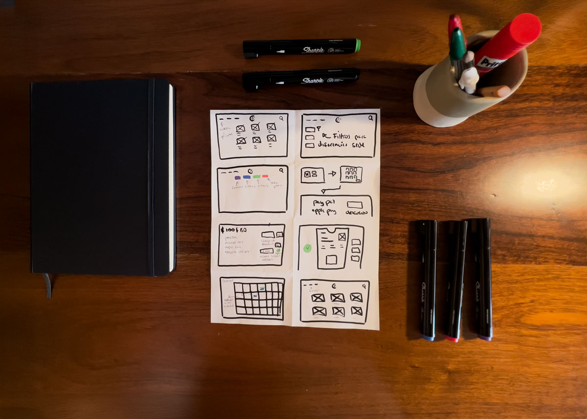
Explored Solutions
• Quick and accessible showtimes – A highlighted module featuring today’s screenings.
• Intuitive venue filters – Clear differentiation between locations.
• Optimized ticket purchase – Fewer steps for a smoother experience.
• Online discount application – A field for discount codes, removing the need to visit the box office.
• Clear purchase confirmation – Immediate visualization of the digital ticket.
• Dedicated events section – A specialized space to facilitate event discovery.
Each solution was designed in direct response to user needs, ensuring a more intuitive and efficient digital experience.
5. Prototyping
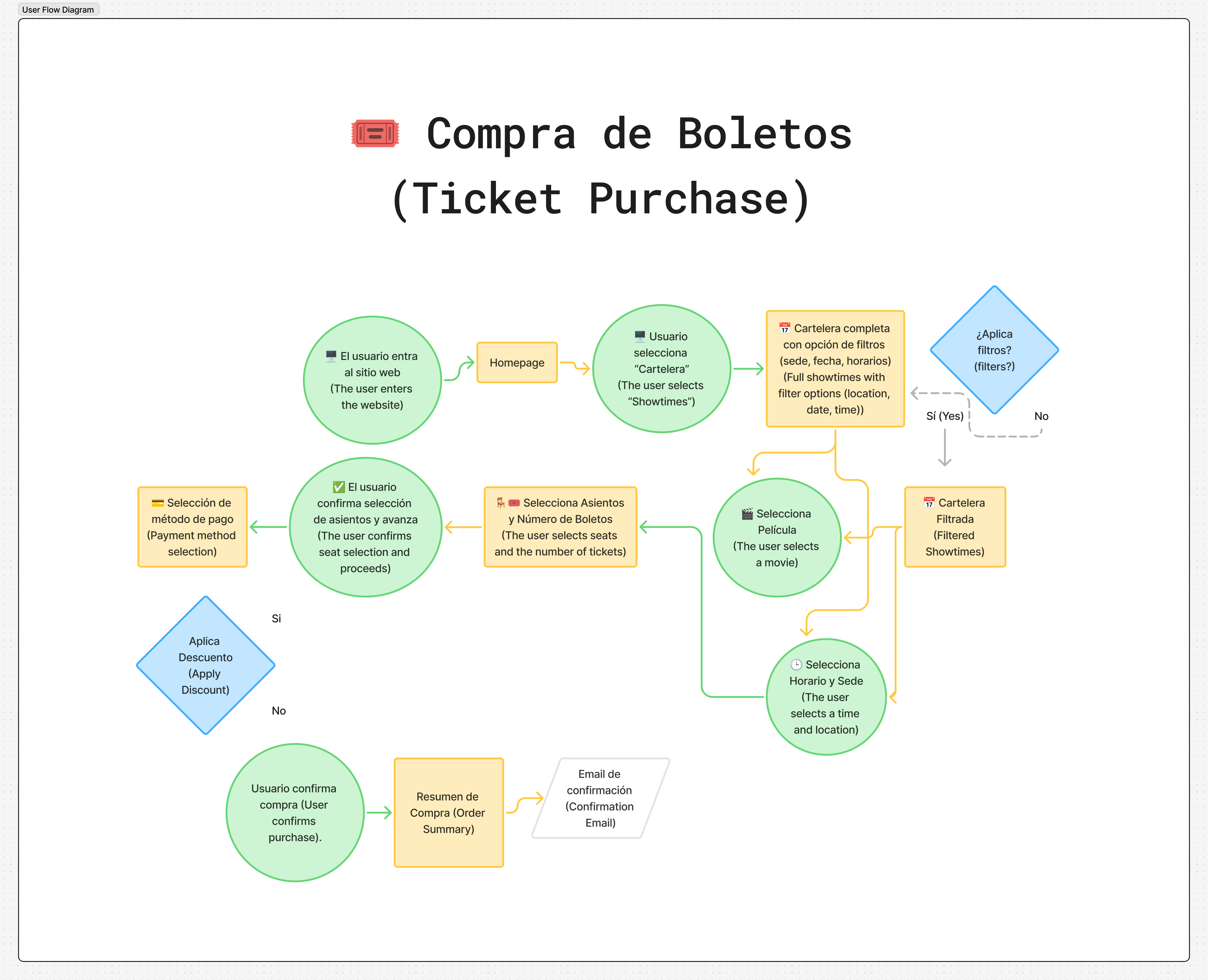
User Flow Diagrams: Mapping the User Experience
Before developing the prototype, I structured User Flow Diagrams to visualize how users would interact with the platform in different scenarios. These flows ensured clear, frictionless navigation aligned with their needs.
The main optimized user journeys include:
• Ticket purchasing: A faster process with fewer steps and online discount application.
• Information and services (later turned into “Discover”): Organized access to schedules, locations, and FAQs.
• Events and special screenings: Intuitive exploration of film cycles with dynamic filters and an integrated purchasing experience
Storyboards: Visualizing the User Experience
Before creating the digital prototype, I used storyboards to represent key user experiences. This process helped anticipate issues, validate solutions, and ensure improvements aligned with real user needs.
1. Luis discovers and attends an event at Cineteca
Luis, a cinephile who plans his visits in advance, checks the showtimes on his laptop after work*

• He finds an independent film cycle and is interested in a talk with a guest director.
• He saves the event and plans his visit.
• On the day of the event, he attends after purchasing his ticket at the box office.
2. Adrián buys tickets online and attends a screening
Adrián, a spontaneous visitor, sees an Instagram post about a Wong Kar-Wai retrospective.

• He visits the website from his laptop and checks the day’s showtimes.
• He finds the screening he wants and buys his ticket online.
• He receives his digital ticket by email and saves it on his phone.
• He arrives at Cineteca, scans his ticket, and enjoys the movie hassle-free.
3. Detailed ticket purchasing flow
To optimize the purchasing experience, I detailed Adrián’s journey when buying tickets:

• He accesses the site and filters the showtimes by date.
• He selects a movie and reviews the details.
• He chooses his seats and proceeds to payment.
• He receives a confirmation email and saves his digital ticket.
Sitemaps: Improving Information Architecture
To optimize the navigation of Cineteca Nacional’s website, I designed a sitemap that reorganizes the information architecture based on the issues identified during research. The goal was to make exploration more intuitive, streamline ticket purchasing, and facilitate access to events and key resources.
Objectives of the New Sitemap
• Quick access to showtimes and events with intuitive filters by venue, date, and screening type.
• Optimized ticket purchasing flow, reducing unnecessary steps and integrating online INAPAM discounts.
• User profile section to manage tickets, saved events, and payment methods.
• Clear organization of venues and activities to prevent navigation confusion.
New Sitemap Structure
• Showtimes → Main page with detailed filters by venue, date, and time, making it easier to browse screenings.
• Activities → Dedicated section for cultural events, courses, and outdoor screenings.
• Archives → Organized access to Cineteca’s film, video, and photographic collections.
• Discover → Information on accessibility, location, contact details, and FAQs.
• About Us → Details about Cineteca Nacional and its different venues.
• User Profile → Personal area to manage tickets, events, and payment methods, including registration for INAPAM discount.
This new structure aims to balance accessibility, exploration, and efficiency, ensuring that every user can find what they need without friction.

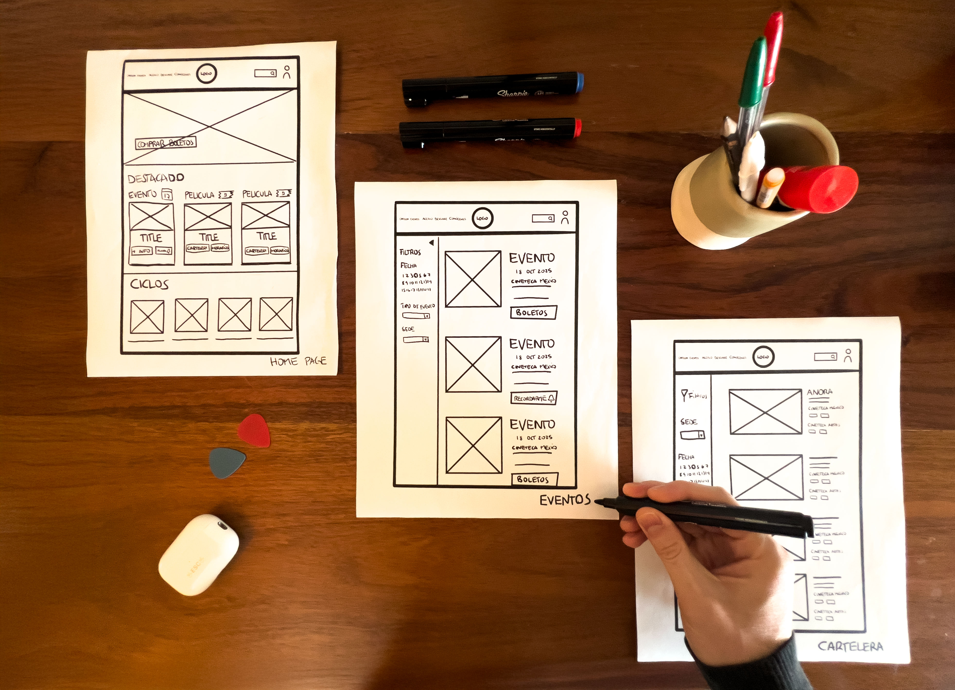
Paper Wireframes: Initial Interface Exploration
After defining the sitemap and visualizing user scenarios in the storyboards, I created paper wireframes to explore different layouts and structures before moving into digital wireframes.
These low-fidelity sketches allowed me to quickly test different navigation approaches, refine the showtimes display, and improve the ticket purchasing flow, ensuring that the interface aligned with user needs.
Key Areas Explored in the Wireframes
• Showtimes & Film Navigation – Improved browsing experience with clear filtering options.
• Ticket Purchasing Flow – Simplified seat selection, payment, and confirmation process.
• Event Discovery & Booking – Easier access to cultural events and film retrospectives.
• User Profile & Accessibility – Seamless ticket management, payment methods, and INAPAM discount application.
Although I explored multiple wireframes for different pages—including the Homepage, Showtimes (Cartelera), Events, Ticket Purchase Flow, and User Profile—this image captures an essential part of the process. These iterations helped identify the most effective layouts before refining the designs in Figma for usability testing.
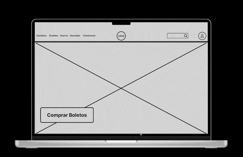
Digital Wireframes and Low-Fidelity Prototype
After validating ideas with sketches, I transitioned the structure to Figma to develop low-fidelity digital wireframes. This version allowed for an early visualization of the user experience without visual distractions and enabled initial usability testing.
Focus of the Low-Fidelity Prototype
• Refine visual hierarchy and navigation.
• Optimize the ticket purchase flow by reducing friction.
• Validate usability before progressing to high fidelity.
Each screen was designed iteratively and data-driven, ensuring a smooth and intuitive experience before moving on to the final design phase.
👉Explore the Lo-Fi Prototype here!
6. Usability Testing and Optimization
To assess the effectiveness of the design, I conducted usability tests with five participants, who completed key tasks within the prototype. Based on their interactions, I organized the findings into an Affinity Diagram, identifying patterns and priority areas for improvement.
Key Findings
• Navigation and filters: Dropdowns were unintuitive; users preferred selectable buttons.
• Purchase flow: Missing a confirmation step before payment and the option to select the number of tickets beforehand.
• Content exploration: Mixing movies and events in the featured section caused confusion.
Implemented Improvements
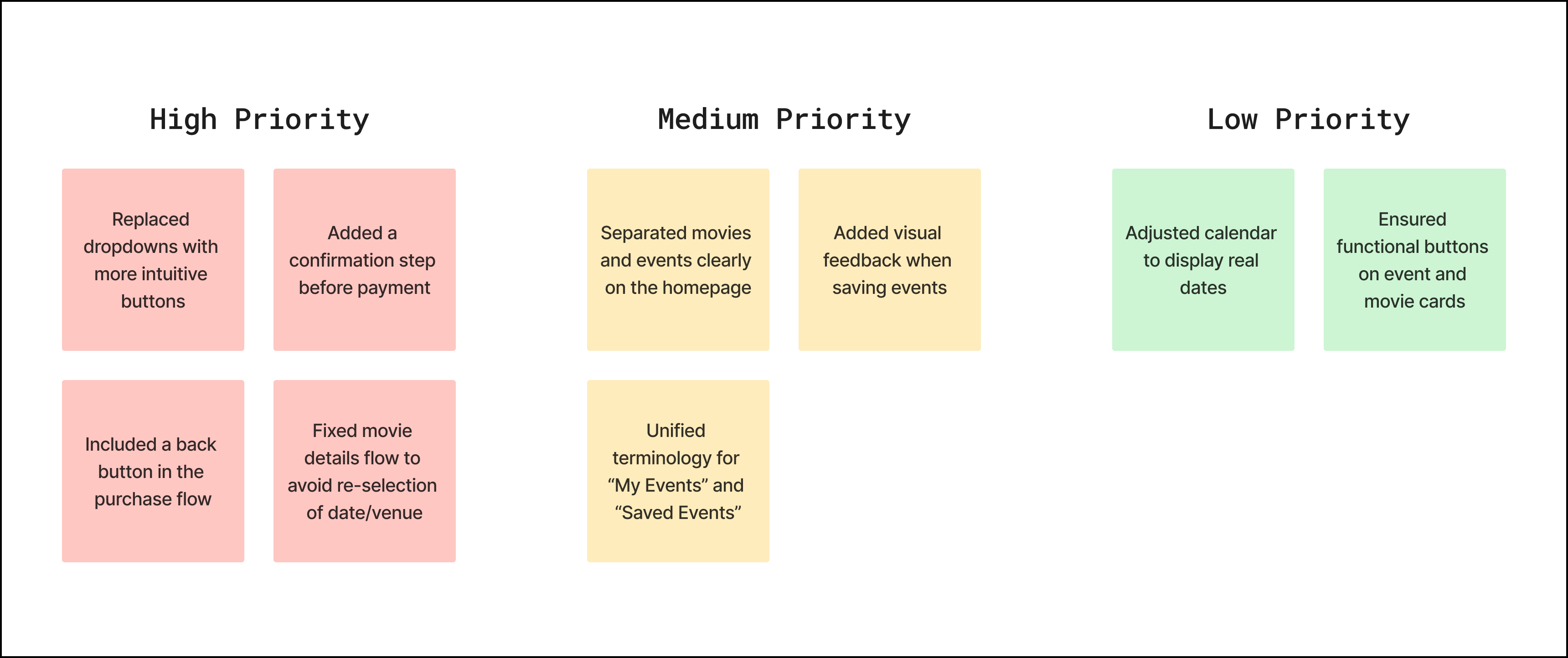
These optimizations improved navigation and ticket purchasing before moving on to the high-fidelity prototype.
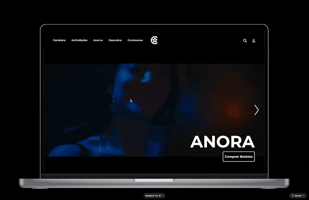
7. High-Fidelity Prototype
After implementing the improvements, I developed the high-fidelity prototype in Figma, refining the design and optimizing the user experience.

Key Improvements in the Final Prototype:
• Optimized ticket purchasing with a confirmation step and intuitive selection.
• Enhanced filters to simplify the search process.
• Increased visibility of events on the homepage, clearly separating movies and activities.
• More accessible and user-friendly interface for both new and returning users.
👉 Explore the Hi-Fi Prototype here!
Conclusion
This case study demonstrates how UX Research and iterative design can transform a complex digital experience into an intuitive and accessible platform. Through a data-driven approach, including usability testing and multiple iterations, the final conceptual prototype significantly improved user navigation, reduced friction in ticket purchasing, and introduced a more intuitive filtering system.
Although not implemented, this project showcases the potential for UX methodologies to bridge the gap between cultural institutions and modern digital experiences. If adopted, these design changes could enhance user satisfaction, streamline event discovery, and potentially increase ticket sales and event attendance. This exercise reinforces my commitment to applying strategic design thinking to create meaningful and effective digital products

